Maximalism | What Is It? and How Do I Embrace It?
Maximalism used to be everywhere. Before the recession, more was more (which is basically maximalism) so people went all out and overboard in their homes. Pattern on pattern, texture on texture, bigger and bigger. Then the recession hit and with money scarce and people being forced to cut back, minimalism took over. Minimalism is clean lines, simplistic and the LESS is more theory. Since the economy has come back some, experts are saying the maximalism will reemerge but there are conflicting beliefs about this. The clean lines of minimalism seem classic and some say it's here to stay for good. However, if you're liking the look of layers and, even though you don't consider yourself a maximalist, you'd like to incorporate a little more into your home, here are a few ways you can do that without going overboard.
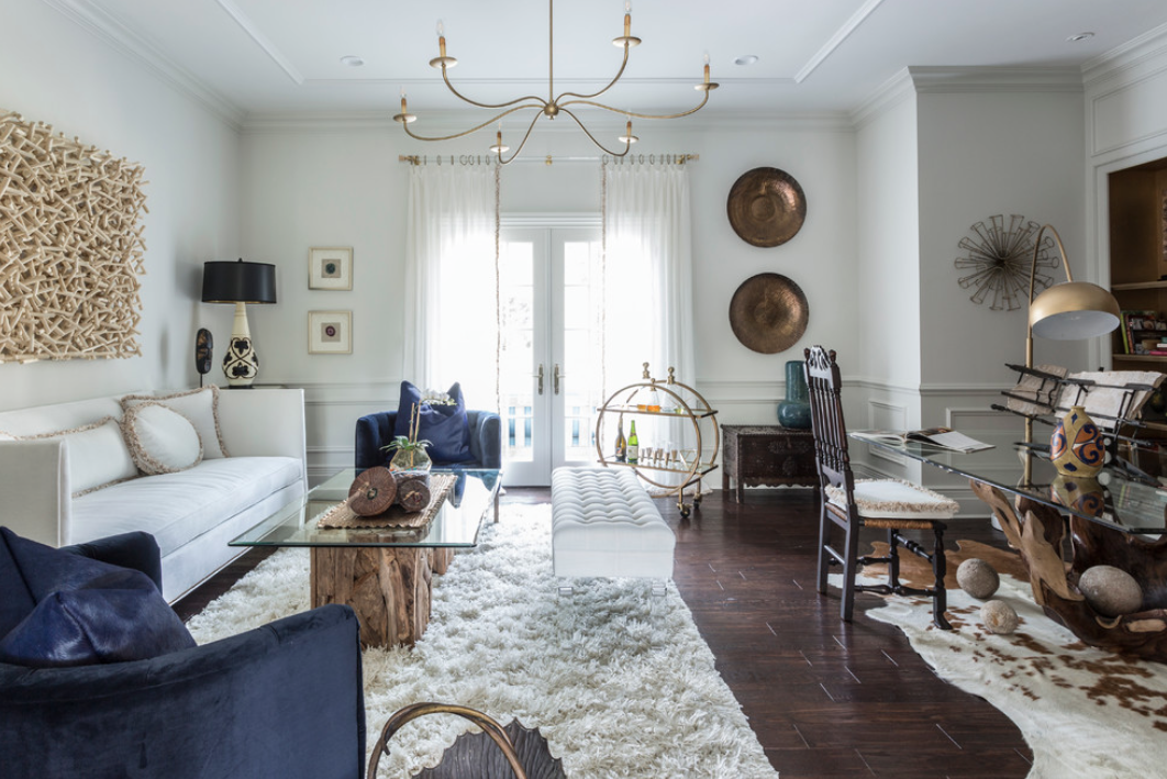
The beauty of minimalism is that there are less items or "things" around to collect dust, so when introducing maximalism it's recommended to do it more with color and pattern than stuff. For example, instead of so much white on white like the minimalist style suggests, add some of the more intense jewel tones. These colors can be great when introduced through tile or art instead of paint because they become a pop of color instead of consuming the space.
Many people think that the minimalist look means having your house look like a model home or un-lived in. This is where maximalism can help! A great way to mix the two styles is by incorporating pieces that are meaningful to you. If you have a collection that you'd like to display, it would be acceptable to do this within the maximalist style. Keeping it contained is best, so don't let it overtake your house, but don't be afraid to show it off either! Your home should be a reflection of you!
Use big impact pieces with bold pattern and color like over-sized art or murals! Instead of trying to fill each wall with art pieces or pictures, pick one main wall and cover it! Top to bottom, side to side. That way you'll have a focal wall that brings enough color and pattern into the room for the entire space but it'll feel cohesive and simple instead of cluttery.
Finally, give us ALL the texture! Texture is the key to any space, really. Not just a minimalist or maximalist style. Texture brings depth. And it's a great way to add visual interest without confusing the eye with tons of color or distracting the flow with too many different objects. Texture introduces the sense of touch to a space which can really impact the comfort level. Your guests will thank you for fun texture so go for it!


