Truly Timeless
We have so many clients who come to us with a budget and say, we want to make this our forever home and we're doing this once. How can we achieve a look that is timeless. This is always a difficult task to be handed. Part of the fun of design is its evolution. As trends come in and go out, design changes significantly so our job and our projects are constantly evolving. It can be lots of fun while also being challenging. But that's also how we feel about a timeless look. Creating something that's timeless requires discipline. A design can't be too swayed by current trends. Rather, they have to have a goal in sight and stick to it. What IS timeless, you say? Well today we're going to share that with you. According to the editors at My Domaine, there ARE certain things that just aren't going anywhere...which makes them timeless. Incorporate these elements into your design and you've got a pretty good start to creating something timeless.
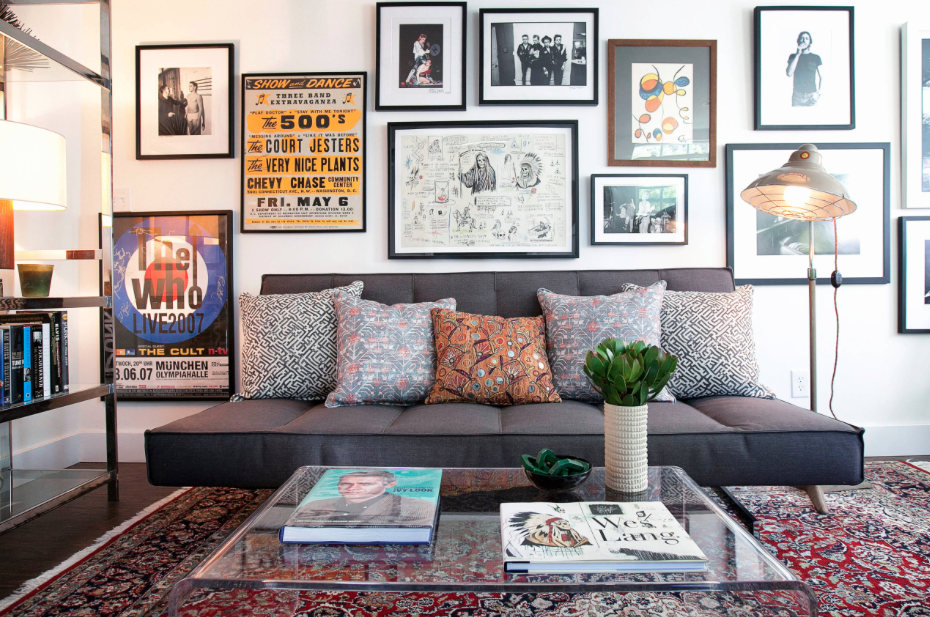
As far as wall space goes, the editors pick was the gallery wall for the timeless look. Gallery walls are a design element but each is also unique in it's own way. Some have art, some include pictures. The frames are different mixes or all the same, and the configuration is always up to the homeowner. Since gallery walls work in some many different spaces, they each make the space feel different. Because they're so versatile, don't expect to see them disappear anytime soon.
When it comes to color, neutrals are here to stay. The very name of this color family shows you that it just works with everything. It's a neutral! Which means, it's hard-working and versatile. Very much like the gallery wall. With whites, greys, and beiges being so popular, a number of mixes have been create to blend these three colors so your neutral color choices are endless! Don't plan to say goodbye to these anytime soon!
We've seen so many different metals be in the spotlight over the last few years. With metals and metal elements really taking a lead in design, a finish has become huge when it comes to design direction. We've seen brushed silver, chrome, gold, rose gold, brass, black...but editors at My Domaine say that the aged metal look is where it's at. No matter the finish, there's something warm and comfortable about an aged metal. It feels worn-in. So if you really want a classic look and you're trying to determine the metal element in the space, go with something aged. It has an expensive look and feel, like it has already withstood the test of time!
Finally, the overall style win that editors are saying will last forever is the minimalist look. It's true...less is more. This style really speaks for itself when done right. It takes key pieces that make a bold statement and let them do all the work. Nobody wants or needs all the stuff anymore, so the paired-down look just works.
Overall, we like the classic look! Neutrals, minimalism, a little personalization with gallery walls, and a touch of aged metal. Not too shabby!


